Wisdump

Dumping wisdom on design and the web

  • Home
  • Best of Wisdump
  • Advertise
  • About
  • Contact Us

Video: TDH on Pownce going Mobile

December 19, 2007 By

Microblogging is cool, with Twitter, Jaiku, Tumblr, and Pownce, among others. The latter now have added a mobile interface, apparently not really meant to go online already, but I tried it out, of course.

Before we get to the video, I’d just like to say that I enjoy Pownce a lot. I’m even a pro user. It’s not the place for everyone, but I’ve found interesting people there, made connections, and so on. I guess you could do the same on Facebook or Twitter, but it haven’t worked nearly as well for me as Pownce has.

If you haven’t checked it out do say hi, I’m at pownce.com/tdh. Give a shout in the comments if you need an invite, although they are rarely hard to come by.

[Read more…]

Filed Under: content tips, legal website

Video: TDH on the Google Adsense Arrows

December 18, 2007 By

Google Adsense arrowsYou see those arrows there, in the Google Adsense ad? They let you browse ads, within the ad, so if you don’t like what you’re seeing you can just go ahead and scroll up and down within the ad. You might or you might not see these ads in the sidebar here, and not all ads get the arrows, but if you’re not then I videotaped it for you, with my two cents on the matter.
Cranky? I guess so.

Filed Under: legal website

Fun With Design: “In Case You Missed These”

October 29, 2007 By

Sometimes design is funny. Or, at the very least, commentary on said design is funny. Check these out, in case you missed them.

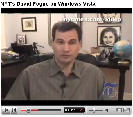
NYT on Windows Vista

David Pogue in a YouTube clip explaining (sarcastically, in case you miss it) that Windows Vista is nothing like Mac OS X. Ignore the flurry of useless comments below it and you may have a good laugh.

Vista and OS X

(NYT is blocking the embed on this one, visit YouTube to watch.)

Wii Safety: The Missing Manual

First, check out this post on the near-comic pages and warnings from the Japanese Wii Safety Manual. That would seem good enough, sporting images like this one:

Image from the Wii Safety Manual in Japan

A Flickr set was started by The Iconfactory with hypothetical images for what was called “The Missing Pages” of the Wii Safety Manual. The first time I saw the group I laughed so hard I cried.

Image from “The Missing Pages” of the Wii Safety Manual Flickr Group

Filed Under: design for poor motor control, legal website

The Pornography Of Information Design

October 19, 2007 By

Information/Pornography

The Web 2.0 love-in is already fizzling out. I’m not alone in thinking that we need a new term for what’s happening around us. Om Malik proposes that we just start calling what’s going on “innovation” again, while Steve Rubel coughs up the “Cut and Paste Web“. Very punk rock Steve, but I prefer to think of what’s going on as the pornographization of information design. *Insert your lewd buzzword here*

Military R&D pushes forward the boundaries of domestic technology. What starts off as the latest way to annihilate existence on a massive scale steadily mellows in old age into Stuff To Sell The Plebs. And what military R&D does for domestic appliances, porn does for the web. Long before we had user-generated content, there were readers’ wives. The Long Tail hardly came as a surprise to the purveyors of ultra-niche web smut, who had been nicely profiting from the divide-and-conquer rule long before Chris Anderson turned up on the scene. And Chris Pirillo’s 24-hour bedroom Ustream is little more than a noxious geekette blip in the world of camgirl telesex.

Porn knows how to survive, and evolve. As the Web 2.0 party starts to flag and falter, pornography offers four key lessons in how to weather the storm. They are an emphasis on:

  1. Presence
  2. Personalization
  3. Paucity
  4. and Promiscuity

Presence

Static content is screwed, and the content that will kick through to the next wave has presence built in. Pornographers know this and have long been using the web to offer premium content that titillates and entertains. The freebies are an incentive, but for presence you have to pay, register as a community member, or otherwise pass into the inner sanctum. The throwaway content is designed to be just interesting enough to lure you into engagement, into action. And presence is the lure.

So now, after a significant lag, we have live streaming video broadcasting for the masses, and in place of cybersex booths, the teenage bedrooms of Stickam users, hat-mounted camera of Justin.TV, and one-to-one call-in action of ubergeek Chris Pirillo.

But presence goes much further, and is only going to evolve from here as a crucial part of web media. Tumblr, Twitter, Jaiku, Pownce, and Facebook status-updates are only the tip of the iceberg of the presence economy. Dynamic engagement at every turn is becoming a crucial component of effective information design. Ignore it and be ignored.

Personalization

Girls and guys are waiting to meet you in your area, and porn knows exactly where that is. It even knows which type you’d like to meet, because you’ve already given some helpful hints about your thoughts on the matter through your clickstream. But personalization of web content is quickly moving beyond ISP-tracking and ultra-niche-targeted content.

The semantic web, bastard child of spyware, is slowly coming into being through – among others – microformats, folksonomy, and the evolving APML standard. With Firefox 3.0 set to bring microformats into the limelight, if you haven’t started using them in your content already, now would be a good time to start. The semantic web will be an increasingly niche-focused web, as rich as the gamut of human perversion.

Paucity

Still reading? You are in the minority.

Keeping information as brief as it can be, and preferably just a bit shorter than that is the order of the day. As with porn, you need to focus on delivering bite-sized, perfectly timed chunks of gratification, while still leaving them wanting for more. Overkill isn’t going to win you any friends – that’s why MySpace and Plaxo in their uniquely horrific ways are never going to be Facebook. And why the most popular blog content at this point in time is made up of snappy content-lite, information-rich top-lists.

Piling on surplus features, ostentatious visual flourishes or superfluous information is like making someone sit through the pre-coital storyline of the worst type of porn. Twitter has more users than Pownce for this very reason – it does one thing, well. No plumber, no photocopier that needs mending. Straight down to business.

Promiscuity

The widgetization of the web isn’t going to slow down any time soon. Closed content, content that refuses to be shared, is not going to be seen. By anyone. Like a porn star that won’t put out, taking a walled garden approach to information design is a sure-fire way to put a swift end to your career or business.

Informational promiscuity is thriving in the world of the widget, the Creative Commons license, p2p file-sharing and the host of other technologies that enable the easy copying and sharing of your information. YouTube videos, Netvibes start-up pages, desktop widgets and mashup-ready APIs are fast becoming mainstream. Focusing on portability and working with the promiscuous nature of bits and bytes are going to be even more important information design traits in the next couple of years – as the web moves out of your browser, and makes a lunge for your desktop.

Naked Information

Pornography is laser-targeted by niche, succinct, mono-functional, dedicated to broadcasting presence and very open to the concept of ready sharing. The standout services and content in the web industry today bear an uncanny resemblance, and it seems likely that the next breed in the strain will succeed by being even more so.

Michael Pick doesn’t sleep. When he isn’t forging tremulous connections between web++ and porn, he blogs, makes videos for the web and sometimes gets paid to tell people how to do the same. His far from erotic blog can be found at http//www.Michael-Pick.com.

Filed Under: Business, legal website, polarization strategy, revenue boosting

Motion Typography: 4 Approaches To Kinetic Text

August 31, 2007 By

Static Versus Motion Typography

In print and web design we spend a lot time trying to nail text down – to make it speak through its arrangement on the page, the selection of font, kerning, leading, space. Motion typography poses an entirely different set of challenges that simultaneously draw on these design concerns, while throwing a whole batch of other decisions into the mix.

Motion typography as it exists today largely takes place in three dimensions – we have come to expect video to create the illusion of depth, unless a particularly super-flat approach is being foregrounded stylistically. Motion typographers have to consider not just the x and y positioning of text, then, but also its positioning within the z axis. Add to that the obvious need for animation – the transition from place to place, but also from form to form, and you have a dynamic array of concerns to deal with.

In these four examples of motion typography in action, I have focused on examples in which the typography is the star of the show. Obviously, in the age of a million motion cut scenes, lower-thirds, station idents and commercials motion typography exists in a vast range of forms. These examples all push text and language play to the center of our attention, using four distinct approaches:

  • Literal illustration of language
  • Rhythmic embellishment of language
  • Personification of language
  • Polymorphous disruption of language

Literal Illustration Of Language

Literal illustration

The first approach to bringing text into motion is to create an interplay between the meaning of the words and their literal form. Now obviously typography in any format is all about wedding meaning, or at least context, with form, but in this approach the text itself is animated in such a way as to expand on or embellish its semantic significance.

In this first example, from Liqueoum, we see some very well executed examples of this literal mode: the word puppets hangs on a series of strings, the mention of flapping wings in the accompanying soundtrack leads to wings sprouting from the word on screen – in short, the meaning of the words is reinforced by the addition of animation.

Rhythmic Embellishment Of Language

Rhythmic Embellishment

Where there is motion, there is inevitably rhythm. But some approaches to motion typography foreground the significance of rhythm more than others, translating text as a visual counterpoint, a dance partner, to the beats, music or spoken word of the soundtrack. Here the focus is much less on semantics – while the words still spell out the lyrics or spoken word they are layered and animated more to translate the temporal dimension into text than the semantic.

In this next example, Artur Dimke creates a great example of a rhythm-led motion typography arrangement. Here we see text layer over text, at points entirely illegible, but reacting with pinpoint precision to the flow of the track being illustrated.

Personification Of Language

personitype-1-1.jpg

Just as the typography process in print and web media place a great deal of focus on illustrating the character or concept of a brief, motion typography relies on the careful selection or design of suitable fonts and placement to get the message across. Going a step further, however, the element of motion can provide an effective way of personifying, and differentiating voices in text.

In this next well-known example, Jarratt Moody draws on both the previous two approaches, while creating a powerful dichotomy between the two speakers in a piece of dialogue from the movie Pulp Fiction. Here we see the differences in power, status, emotional state – the whole gamut of psychosocial dynamics between the two speakers – directly translated into their typographical form. I particularly love the paint spatter effect as desperation and terror creep into the second character’s voice.

Polymorphous Disruption Of Language

polypmorphotext-2-1.jpgThis final example is the one that excites me most, as it seems to me the very essence of motion typography allowed to run totally wild. Yes, rhythm, literal and metaphorical illustration and personification all play their roles here, but overriding all of them is the very instability of language rendered directly through text.

In Petra Mrzyk & Jean-François Moirceau ‘s music video for french artist Katerine, we get to see an amazing breadth of freeform typography, as words literally fly out at a breakneck pace, and exist for the briefest time in constant, polypmorphous transition. Here traditional typography is thrown out of the window – there is never really a point at which any one frame of the video might be taken as a fixed point or final version of the motion fonts being used. The emphasis is on the motion itself, the continual process of change, the fragile shifting nature of language.

Blurred Boundaries

Obviously each of the examples above have more than trace elements of one another’s approaches – the very nature of motion typography, especially as wedded to music or the spoken word – demands that it takes some stance towards rhythm, the literal or metaphorical position taken regarding semantics, the personification or conceptualization of text, and of course the need to animate and set in motion typographical design elements.

Nevertheless, what we have here are four distinct approaches to which of these elements are pushed to the fore. Four approaches that distinguish key differences between the print/web perspective on typography, and that taken by those putting it into motion.

Michael Pick is a web videography hand grenade. But a nice hand grenade, like the one the Diane Arbus kid has, or the pop art grenade from The Invisibles. You can track his latest doings over at michael-pick.com should the urge arise.

Filed Under: freelance writing, legal website

Next Page »

Categories

Web Design Tools You Wish You Knew About When First Designing Your Website

Best Resources to Use for Web Design Ideas

The “Horrible Web Design Client:” An Infographic Look