9rules: Add More, Subtract More
Last February, I gave a less than glowing review of the old 9rules homepage. I really loved the design when it was finished, but after hearing how many people thought too much was going on I started to understand where they were coming from.

Fortunately, Mike Rundle (does he ever drop a design that isn’t hot?), understood the public’s reaction and we went back to the drawing board. We could’ve released another version of the homepage a week later and were very close to doing so, but realized that changing too quickly can wear people down and we did not want that to happen. We also knew we had some new things planned for 9rules and when I did the initial skeletons of the site, we found that these new features enhanced the homepage tremendously.
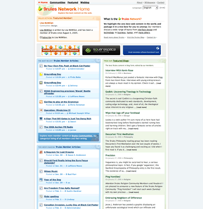
Looking at the screenshot of the previous 9rules you can see aesthetically it is a nice looking site. The problem was it was a very busy, nice-looking site. Instead of being able to scan the page you almost got lost in it to the point where you just wanted to get away before your brain exploded so our first goal was to simplify things. Here is what we came up with:

So even though we added a whole new dimension to the site, 9rules Notes, we were able to compact the page and make it easy for your eyes to skim. There are still some adjustments to be made such as short descriptions of what each column represents and a couple more stylings, but we are very happy with what we were able to achieve by subtracting from the previous design.
So please go check it out and take a tour for yourself and post some Notes and thanks for the incredible feedback after our last redesign. Without it we might not have been able to achieve what we did today.
Related reading:

[...] Scrivs [...]
By usmediaweb» The CC Anthology » 9rules: Add More, Subtract More on July 20, 2006 3:57 am
[...] The previous design of 9rules was nice but I have to agree with Scrivs that this version was a bit “busy” and uncomfortable for users to find something. [...]
By New design of 9rules Communities - RotorBlog.com on July 20, 2006 4:43 am
Congratulations on your redesign, Scrivs, Mike and Colin. I know you guys were working your tails off today.
By Michael on July 20, 2006 5:05 am
You forgot Tyme Michael. If anything she did more work than all of us combined.
By Scrivs on July 20, 2006 5:15 am
I was actually talking about the design. I know Tyme did a ton of writing the day off. The featured page was filled with her writing.
By Michael on July 20, 2006 5:26 am
I was actually talking about the design and technical part of the launch. That was today right? I was going to congratulate Tyme on those wonderful communities later.
This is afterall more of a webdesign blog is it not? Gosh I’m such a weirdo. Congratulations to you all.
By Michael on July 20, 2006 5:42 am
Well in that case you are correct in thanking the guys. Tyme gets enough props anyways.
By Scrivs on July 20, 2006 5:46 am
Yeah even I can’t explain my own weird reasoning. It must be part of my strange personality. :)
Design props go to design people and non design props go to non design people. Appropriate prop to the appropriate person for the appropriate reason.
By Michael on July 20, 2006 5:59 am
I agree because it is the only appropriate thing to do.
By Scrivs on July 20, 2006 6:33 am
[...] 1) Featured Blog Entries I like the idea behind these, but sometimes they can look like text ads and my initial reaction is to ignore them. The concept is solid because 9rules 2) Community Leaders Why does there need to be one (or a few)? Isn’t it a community because everyone contributes. 3) Recent Member Articles Good. but looks like clutter sometimes. 4) Hooray 9rules The most interesting new feature of this launch is called 9rules Notes Good job. Nice feature. 5) Woooooo Both members and non-members are able to post a new Note via the Community page and it will show up in the “Latest Notes†area 6) Schplack There it is again. Big. Fat. List of 32 categories. Thanks guys. (Plus you might wanna figure out Fatal error: Call to undefined function: phoenix_ulcommunitieslist() in /home/httpd/vhosts/9rules.com/httpdocs/browse/phoenix_footer.php on line 3) There are still some adjustments to be made such as short descriptions of what each column represents and a couple more stylings, but we are very happy with what we were able to achieve by subtracting from the previous design.9rules: Add More, Subtract More » Wisdump [...]
By 9rules Definative Review : Fresh Brewed Every Morning on July 20, 2006 6:40 am
I really liked the last design, and I still like this one, although I would prefer a white or light blue background. Anyway, well done on the design, looks really cool. Especially the Notes!
By Robert Day on July 20, 2006 7:39 am
I especially appreciate not having to go two levels deep to get to the design community, I can now click on it from the homepage. I do wish the entries and notes had brief (even one line) descriptions, because we all know titles can be deceptive.
By joe on July 20, 2006 8:31 am
very well done, I love the new look alot better than the last.
By J Phill on July 20, 2006 8:56 am
Come on Mike, can’t you make just one lousy design; you’re making the rest of us look bad;) Nice work guys; I’m loving the redesign.
By Phu on July 20, 2006 7:25 pm
This deisgn for me is all about the information and user interface. It is a great leap in that for me and the little details are what makes it much more successful in my mind. The design before needed a bit of mind training in use – this one is so intuiative and natural to use for me anyway. I love the notes and it makes a great difference to the community aspect I think. I miss the recent feeds from the communities a bit – but I can get that using the community feeds so nothing missing there really. The cleaning up of the interface is just what shouts out a stronger and possibly dare I say it more ‘mature’ design of the layout.
By karmatosed on July 21, 2006 5:38 am
i liked the old site better, i think they went too far with the redesign – and now feels darker. though putting the catagories ontop was a step in the right direction.
on the bright side, they still have the best rss feed around.
By oronm on July 21, 2006 1:19 pm
I think, you have big team, and able to create few tables, and change them one time in season. Like yahoo does
By German on July 22, 2006 5:39 pm
I really like your redesign as well, Im just not too crazy over the green header. But otherwise great job.
By Freddy on July 22, 2006 7:14 pm
I like the colors more on the old version but I think the new version is much better. Easier, you know where to look. It’s really good that you can find the categories right away now. Good job guys.
By Daniel on July 23, 2006 1:58 am
I still definetely love the older, simpler, cleaner design and content presentation but when you’ve got too much info it becomes more difficult UI wise to fulfill the requirements and demands of different types of viewers. :)
But I do LOVE the new header area with all the categories place above. For me, it’s like a ‘Google Search’ without the search field now. Kudos!
By Danny Foo on July 23, 2006 11:19 pm
I love the new design. Thanks for giving the new design structure an open feel; I actually use the site now! I found the last design difficult to navigate, so I didn’t bother spending much time figuring out what was so damn important about 9rules. Now, I’m visiting almost every day.
By Ashe on July 25, 2006 9:35 pm
Sad (but forseeable, given the way things stood) that one of the things substracted was the spanish section. Such a pity a great idea was never given wings.
By kemie on July 26, 2006 5:56 am
I like the old one better. It looks cleaner and more natural. It has a natural flow to it. This new one looks too boxy.
By Tom on July 26, 2006 8:40 pm
Green seems to be the new white in the Web02 world mmmmmm… Interesting choice of color in that is is so similar to this
The new design looks great by the way. I’ve enjoyed browsing through it. Cheers to all of you!
I have never looked at the color green as the color for money. It is the color of life, growth, and beauty to be envied.
By Jessica Doyle on July 27, 2006 11:05 pm
I’m sorry, but I absolutly hate the new site. It looks like crap.. and it really just dosn’t fit 9rules. I’d switch it back, or give visitors the option to switch.
By Andre on July 28, 2006 11:18 pm
Hi,
been waiting a few days before i could say something about your new homepage…
maybe i’ll get used to it, you guys are good nanana…
Sorry to say so but i don’t like it…
the green is too powerful, it blinds you with the multiple communities wich is a second navigation choice for me, the rest is pale, i dunno, like some said, it looks like a vacant domain page…you’ve gone too far ;)
why the f#### did you change ?
By Fab on July 29, 2006 10:43 pm