say something

Wisdump redesign concept, part 2

The Wisdump redesign concept I posted previously have been updated. It still follows the same basic premise, but is now populated with more content, and the sidebar top isn’t as heavy.

Compare the version below with the previous one. The image is a bit distorted, but you get the general feel.

Wisdump redesign concept 2

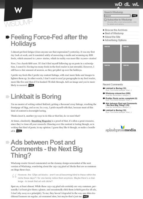
Feedback is appreciated. What do you think?

Comment with Your Facebook Account

8 people says things!

  1. i don’t know… i like the current version more. maybe just improve it (with a network bar) somehow?

    for the concept:
    the headlines are a bit too heavy/bold. maybe try a different font?
    the »wD, dL & wL« are kinda floating around, maybe add them on a different bg color.
    i don’t like how the logo is being integrated. if you stick with this version, you might want to align the logo with the headlines, not with the arrows.

    By Alexander on January 23, 2008 11:16 am

  2. I just cant get used to that “slanty” logo. It’s the first thing I see and then it takes me up to the top right of the page, which then brings me down the sidebar missing the content all together.

    Continuing on Polski’s comment in the last post on the redesign, I felt the same way after reading your post. Maybe re-read your post on Devlounge. I don’t see much change between your current version and this version of the redesign, except the sidebar is on the other side and the logo is housed in a strange “slanty” thing instead of a circle. Gray, gray, gray, leaving the only the splashmedia logo (and ads once added) to stand out above all.

    By Jeremy on January 23, 2008 11:33 am

  3. I like the slanty bits and monotone. Colour images with the articles will be very eye-catching. And I always think that serif headers and sans-serif body text is easier to read.

    By 01010 on January 23, 2008 11:46 am

  4. The slant logo – makes it more than a little odd. The ‘wD dL wL’ – I cannot intutively know what they are meant to be.

    Monotone seems to be fine. A clean design other than that.

    By Vyoma on January 23, 2008 6:17 pm

  5. I actually like the slanty logo. It’s eyecatching and breaks with convention of having everything in neat little boxes.

    The typography is nice too, although I might go a little smaller on those titles. As Jeremy said above, an injection of colour wouldn’t hurt.

    Overall, a nice clean tasteful design. Good work Thord.

    By Gerard on January 24, 2008 12:36 am

  6. I’ll follow up this one as well, with more fixes, and my reasoning for the logo as well. I most certainly will try smaller fonts for the headlines, I find them a bit much myself at the moment.

    Still debating wether or not to add an active link color. There will be hovers of course.

    Also thinking of scrapping the network bar and solve it some other way. That would, however, mean that the logo design might not work out. Could perhaps tighten it up, do a top line, and… Ah, we’ll see. With any luck, a third (and final?) mockup will be posted before the end of the week.

    Keep your thoughts coming!

    By Thord Daniel Hedengren on January 24, 2008 1:30 am

  7. well .. the triangle under the WD DL and WL could be more angled to mimick the slanted box and logo on the left..

    As for the headers of the posts .. I’m always a fan of large text headings .. as you know.

    By HART (1-800-HART) on January 24, 2008 10:58 am

  8. I’m not a designer by any means, but there is a certain appeal to slanted logos. It’s offset from everything on the page and is eye catching without being too obtrusive. Is this just me saying this or is there a defined reason for slants?

    Oh, and I really enjoy the redesign. Great work.

    By Reza on January 29, 2008 12:51 pm

  9. Subscribe to comments via RSS!

    What do you think?

/* */