A couple of days ago when I posted my tiny design critique of Snap’s homepage Jason Santa Maria almost wrote today’s review for me.
As far as search engines go, Snap is a waste of space. It’s so slow and bloated, it renders itself practically useless. I don’t need a search engine to load in big images for the results, just give me the damn information! The “Why Snap is Better” page seems to gloss over the fact that if you want to go toe-to-toe with the best contender, you need to at least do as well as they do with the basic tasks. I would rather see a strong and fast search engine, then bloat-ware complete with Javascript scroll bar. Not even in the same ballpark man.
I didn’t let that deter me and decided to dig a little deeper into how the search engine works.
The Beginning
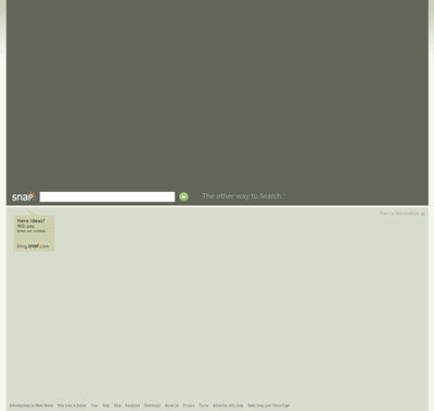
When typing in the search box with the term “Scrivs” (nope, not vain at all) the searchbox went through each letter and did one of those autofill type of things, but unfortunately I was already done tying so that “feature” served no purpose. My connection is slow today so it is possible this played a role in it being so slow, but if that isn’t the case then there is no reason to have it up there.
The Results Page
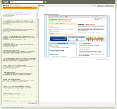
This is where Snap begins to differentiate itself from other search engines. The search results page isn’t filled with just text results, but also screenshots with previews of where you are going if you decide to click on the site. To view the site you simply have to click on the image. Now this technique can easily divide people in two different camps.
First you have the people who think that a search result should bring you immediately to the site because that’s what they are searching for and not screenshots of where they might want to go. This isn’t a gallery search engine and including the screenshot not only increases the loading time, but also adds another step to finding what we want.
The second camp could easily argue that the screenshots take away the step of clicking on the result and not liking what you want and then having to press the back button or close the tab to get back to the search results. Of course this technique doesn’t serve any purpose when there is no screenshot available at all and therefore requiring another step to get to the results you have been looking for.
Initially I admit to falling under the first camp, but after some use I am starting to see thing the way the second camp would. Search results on any search engine simply do not always provide you with information in their excerpts and therefore many times you are left playing a guessing game hoping to find the best result. At the very least Snap keeps you on the site although it doesn’t compare to the speed of other search engines, but that is something that can be improved over time hopefully.
The results page is powered with AJAX technology so there are never any refreshes, simply watching a loading screen while waiting for either the screenshot or site to appear.
Once You Check-In, You Can’t Checkout
After clicking on the image in a specific search result you are taken to the site…but you still remain on the Snap site as well.
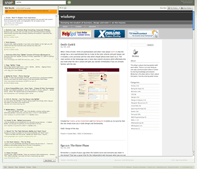
I wonder if they every considered simply taking you directly to the site when you click on a search result instead of having to view the screenshot first? You do have the option of visiting the site outside of the window, but that button has to be clicked for every single search result so to remain efficient its best to stay on the Snap.
Small Resolutions Need Not Apply
This will more than likely be one of the top reasons for the everyday user to stay away from Snap and it has to deal with screen resolution. When you first use the search results the default image is at the largest setting which can be changed by clicking the image resizing links at the top (not like you can tell what they really mean), but at least if you change to the smallest setting it remembers that for the rest of your search results. For me it even remembered when I left the site and came back so that is a positive.
However, once you click on the image and are taken to the site, the site is viewed in all its glory so depending on your resolution you will more than likely encounter scrollbars, which isn’t what you want when you are trying to get to your results as quickly as possible.
Final Thoughts
I wouldn’t classify Snap.com as a search engine website as much as I would a search engine web application. It’s definitely not geared toward the everyday crowd or anyone with a slow connection and/or small resolution. However, power users may find that it can be more efficient than using a typical search engine such as Google or Yahoo. I haven’t played with it enough to completely decide if I wish to abandon it, but I know for certain there are search queries that would work better on Google (etc. images, spelling, language translation, etc.).
Digging deeper you will see that the site uses a great deal of keyboard functionality that power users may find useful once they learn the system, but this further proves that the site was not intended for everyday people. I don’t think Google has to worry about Snap taking their crown anytime soon, but at least it’s good to see companies taking new approaches to an old process.
Originally posted on May 19, 2006 @ 3:54 pm