Last February, I gave a less than glowing review of the old 9rules homepage. I really loved the design when it was finished, but after hearing how many people thought too much was going on I started to understand where they were coming from.

Fortunately, Mike Rundle (does he ever drop a design that isn’t hot?), understood the public’s reaction and we went back to the drawing board. We could’ve released another version of the homepage a week later and were very close to doing so, but realized that changing too quickly can wear people down and we did not want that to happen. We also knew we had some new things planned for 9rules and when I did the initial skeletons of the site, we found that these new features enhanced the homepage tremendously.
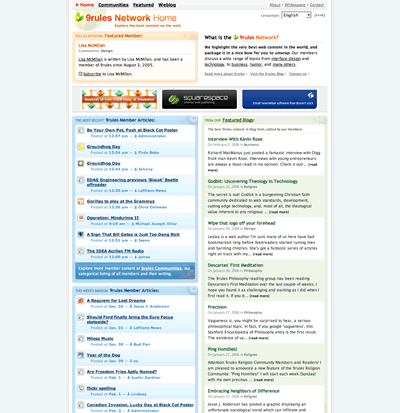
Looking at the screenshot of the previous 9rules you can see aesthetically it is a nice looking site. The problem was it was a very busy, nice-looking site. Instead of being able to scan the page you almost got lost in it to the point where you just wanted to get away before your brain exploded so our first goal was to simplify things. Here is what we came up with:

So even though we added a whole new dimension to the site, 9rules Notes, we were able to compact the page and make it easy for your eyes to skim. There are still some adjustments to be made such as short descriptions of what each column represents and a couple more stylings, but we are very happy with what we were able to achieve by subtracting from the previous design.
So please go check it out and take a tour for yourself and post some Notes and thanks for the incredible feedback after our last redesign. Without it we might not have been able to achieve what we did today.
Originally posted on July 20, 2006 @ 3:45 am