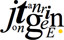
Jon Tangerine, David DeSandro, Trent Walton have all come up with ingenious ways to create image-free logotypes by pushing the limits of CSS (Sean Martell made a mouth-watering CSS-based logo too, but doesn’t contain text) that one has to wonder: is this the next step in online branding and identity?

The simplest argument against this could be that a logo must be constant. In the absence of CSS styling, possibly even helper JavaScript, an image will not suddenly morph into a default browser style and render a brand generic. See the image above for how the CSS-based Opera logo degrades in different browsers.
Now that excludes the scenario where images are turned off, and where text—styled text—can come in. Instead of simple image replacement techniques, we now have @font-face embedding and other advanced effects to bring the text as close as possible to the original design.
Text is great because you can read it, as can search engines. Another thing text based logos have going for them is they’re easier to make bigger; that’ll win over a lot of clients.

But there’s a great deal of extra markup required to achieve the necessary look. Does this make sense for the notion of a logo, which is inherently more portable with an image than with a bunch of divs, spans, classes and IDs? Should logos always be images and nothing but, or can they be both text and images? Which should come first, designing the logo in the browser or in a graphics program? Or should all of this experimentation remain just that: experiments?
Me, I just love we could be on the brink of shattering print conventions, yet again.
Originally posted on May 28, 2010 @ 10:06 am
