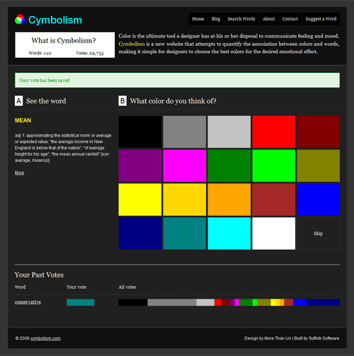
Devlounge has posted an interview with Mubashar Iqbal, creator of the increasingly popular color-oriented website Cymbolism. It’s an initiative to gather data on how people associate words with color.
If you’ll spend a fair amount of time at Cymbolism, you’ll find out that despite all preconceived notions tied to the different colors of the rainbow, people still think differently. For example, red is the dominant color associated with the word “powerful”, but only by a little more than 50%. The word “bold” shows a similar trend, with the color black in second place.
Now when you take a look at “new”, there are at least four major colors showing relative popularity: red, green, yellow, and white.

Based on the results, if you’re going to design one of those typical Web 2.0 badges that say “NEW!”, which color are you going to go with? It’s harder to choose now, isn’t it? I’m not implying that the site is useless in helping you decide colors. In fact, it teaches a very important lesson in color sensitivity. As the latest article in Cymbolism’s blog points out:
It can be a poor choice to assume that you know what another culture means by a specific color, so asking questions is a good idea. You can also do some research if you’re planning a trip to another country so you know a bit about their culture before you leave. You can avoid offending people that way, get a better understanding of culture and how color affects us, and have a more enjoyable trip.
Because the web is like one big country anybody can visit, web designers should be aware of yet another factor that affects the experience of their virtual audiences. And another issue you’ll have to deal with as a web designer, as opposed to a print designer.
What are other color-related factors can affect how a website is perceived? Aside from the psychological, how about the physical? Here are some questions you might want to answer before rolling out that website for public consumption:
- What does the website look like from the eyes of someone who is colorblind? Note: there are different types of color blindness.
- What does the website look like from an uncalibrated monitor? A monitor that is different from your own? (e.g. LCD, CRT, plasma, projection) A monitor running a different operating system?
- What does the website look like in low light? In bright light? In low contrast? In grayscale? In black and white (i.e., does the design of the website rely on color alone)?
Originally posted on August 7, 2008 @ 2:19 am
