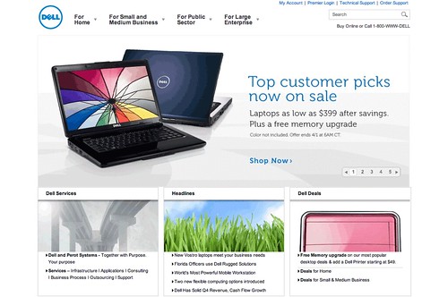
What does it mean for Dell to choose Exljbris’ Museo and Museo Sans as its new corporate fonts? Maybe not much for some people, but as one who has enjoyed using the almost (some characters were modified for the company) the same fonts as freely as can be (some weights are paid), I feel like I’m sharing in Jos Buivenga’s triumph too.
A triumph for the little guy. A triumph for freedom, sharing, open standards. A triumph for hard work and talent that deserves to be recognized in the best possible way.
Museo and the other Exljbris fonts are also as ubiquitous as the Microsoft and Apple system fonts, at least on the Web, because they’re good and free. They’re like the new generation of default fonts to play with, since they’re the most accessible. Same case with The League of Movable Type.
Originally posted on March 31, 2010 @ 3:41 am
