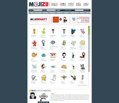
Images. When used correctly they can be the most effective aspect of any design and a requirement when your site revolves around them. Mojizu is that kind of site that sucks me in due to its images. I will quickly admit that the dual-colored background on the headers is annoying, but the rest of the site simply works for me.
Seriously, any site that can keep my attention for over a hour has to be doing something right, unless of course you consider me feeble-minded…*cough*.
I love how the homepage just gets right to it by showing a ton of character designs encouraging the users to dig deeper. The color scheme is smooth to my eyes and they did well on the individual sketch pages. It’s just those damn header backgrounds…
Originally posted on May 23, 2006 @ 11:52 am
