The three-dimensional, folded look hailing from the fascinating art of origami has been circling my design radar for a while now now. Let shop around for a bit of inspiration and see how you can inject it in your own work.
A really short history of Origami
Origami is a Japanese word that literally means “folded paper”. While the term itself showed up only as recently as 1926, it’s been around much longer, as the use of cut and folded paper was first used in religious rituals. It was during the Heian period, when paper became a more abundant commodity, that origami branched out into a form of entertainment. There is documented proof that paper folding developed independently in Europe as well.
Get the look
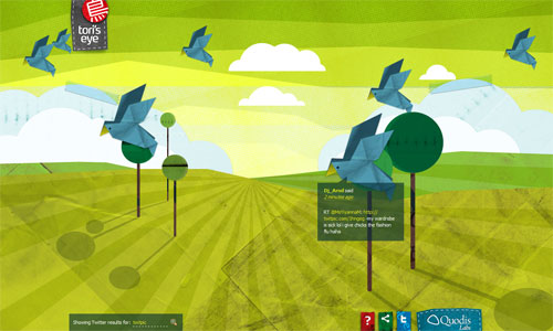
The easiest way to go origami is to use imagery that actually follow how folded creatures and objects look like. In this case, the website Tori’s Eye uses birds. It takes a step further and gives different textures to the background to match the playful, crafty feel. Top it off with some JavaScript animation and you’ve got yourself a stunning origami-inspired website.
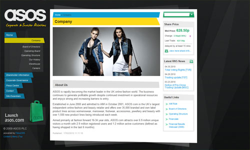
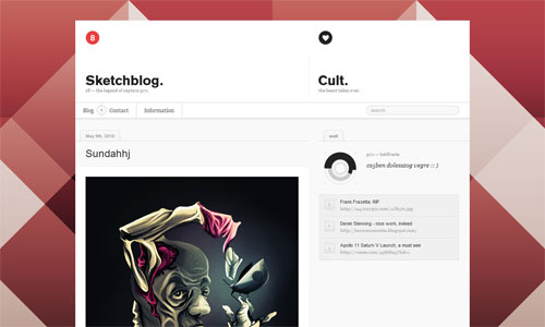
This one is a less literal interpretation of the origami look. The idea is to use a lot more diagonal lines instead of just perpendicular and parallel ones. The shapes behind the main content area seem to be mimicking sheets of paper stacked together, but keep it abstracted with transparency effects. This happens again in the background.
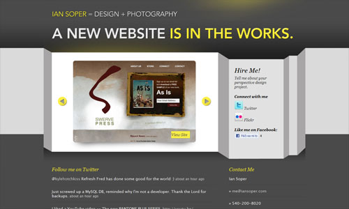
Ian Soper’s site looks it has a long sheet of paper with many folds standing upright. Spreads for iPad does the same thing, but vertically.
Fonts
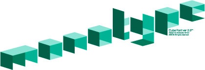
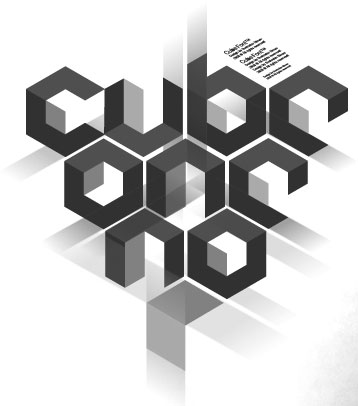
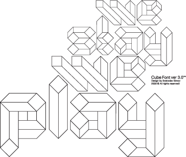
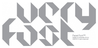
Choose more angular, abstract typefaces for a nice origami effect in text. There are a ton of origami-inspired alphabets out there, so I’ll just list fonts you can actually use:
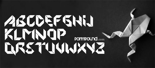
Origami font by Formfound (Peter Fritzsche) (free for personal use)
You can also use dingbats and other similar accents:
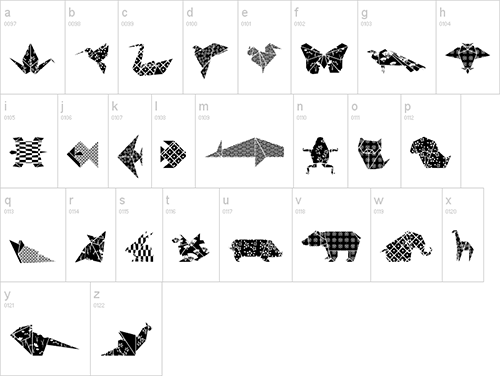
Origami Bats dingbat font by Lauren Ashpole (free for personal use)
Logos
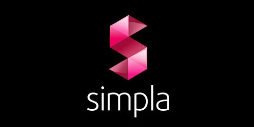
Color and shade are playing a bigger part in current logo trends so it’s no surprise that illusions of three-dimensional effects, including folded shapes, are popular right now. The logo for Simpla CMS is one such example.
These logo concepts by TKhoury actually use the folded effect to convey more meaning.
Some closely related techniques to be inspired by: cubism, facets, hexahedrons, ribbons, quilts, mosaics, optical illusions.
Icons
![]()
This social media icon set by Paddy Donnelly is a breath of fresh air from all the other ones out there. Adding these to websites short of mandatory lately and if you’re adventurous enough, why not go for this almost abstract look? Or make your own—it’s a great exercise for deconstructing recognizable logos.
Buttons
I know that rounded corners, especially with “the new (CSS3) hotness”, are not only trendy but have also been psychologically proven to appear more friendly and thereby more clickable, but you can still apply the basic idea of making sure a button looks like a button while retaining a more geometric, less marshmallowy feel: use gradients, bevels, and shadows.
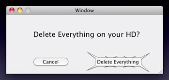
You could even go the opposite route and apply the sharper edges on buttons you don’t want users to click, which Jeff Atwood calls The Opposite of Fitts’ Law:
Uncommon or dangerous UI items should be difficult to click on!
The spiky button is an exaggerated example, but the idea is sound: apply the less welcoming look of hard edges on the buttons you don’t want users to click on.
Backgrounds
It’s the easiest and most recognizable way to incorporate a certain look in a design, and you can pick from a variety of options: patterns, textures, or photographs.
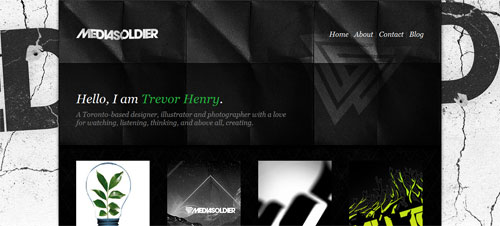
Mediasoldier uses a folded paper pattern in the header background that really captures that origami feel but also matches the grungy and grid-loving look of the site. It also mixes with two other backgrounds: the striking cracking concrete wall, and the subdued diamond fence.
Other Design Touches
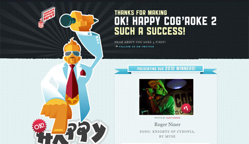
Will graphics be prominent in your design? Give them a 3D twist. The illustration on Cogaoke is an excellent style. Bonus points for imitating Japanese character styles in the text “happy”.
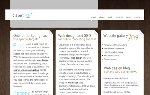
Dog ears and page curls can be elegant additional touches instead of distracting and annoying. And although Cleverclick’s design isn’t so obviously origami-like anymore, the still exudes its minimalist, organic sensibilities.
Fold away
Origami is a great design concept to build upon. Experiment with shapes, shadings, and space to come up with an edgy look—literally.
Originally posted on May 14, 2010 @ 3:09 am
