 I’m in Japan, it’s Monday, and I have yet to get my act together and take a dive in Japanese design. It takes time, it seems, to do that. Honestly, it’s quite overwhelming to follow take it all in. Just the fact that the kanji characters that the Japanese written language consists of is an almost graphical element by itself, since most of us can’t read them, is something that I need to ponder and consider the implications of.
However, these things strike me right on, in no particular order, about Japanese design in the public room.
- Colors are plentiful.
- If uncertain, add a speaking dog or something to your commercial spot.
- Hello Kitty.
- English is cool, so don’t worry if you can’t spell correctly.
- Neon always works.
- Magazines should have lots of noise.
This isn’t the country for minimalists. I’ll take a closer look at various phenomenons during the coming week, especially advertising and print magazines, I think.
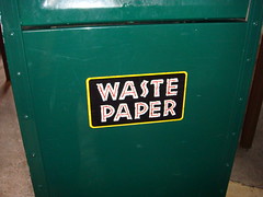
Oh, the picture to the right is from Universal Studios Japan. It’s a trashcan. The type is ironic to say the least, since cutting down on waste, such as unnecessary plastic packaging, paper napkins overflow, and so on, isn’t something that is remotely in the Japanese social mind, it seems. So please Waste Paper, eh?
Originally posted on February 18, 2008 @ 10:38 pm