One of the concepts in web design I like most is the grid, gridified design. Popularized by Grid-Posterboy Khoi Vinh the beauty of the grid finds its way every day more in modern web design. There are numerous examples of great grid design. Recently a grid CSS framework was released and many designers offer tools, aids to simplify grid design.
Whitespace Rules Grid Design
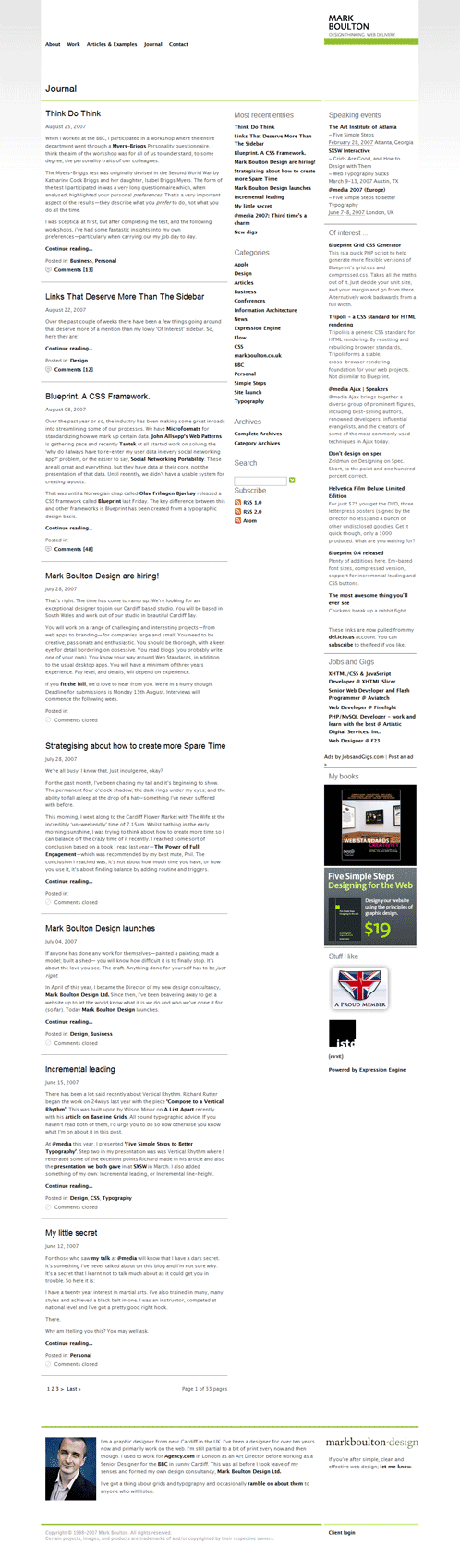
A central element to awesome grid design is whitespace. Whitespace and correct padding. Without those your grid-coolness will soon look cluttered and horrible. Both Mark Boulton‘s and Derek Punsalan‘s design excel in whitespace and look very spacious. A notable mention for the whitespace factor in grid design goes to the unfinished Avalonstar.
Gridified Or No Grid
Many designs online look like a grid but aren’t. One of the specialists in this category is Brian Gardner who released two grid-like themes, Revolution, the premium WordPress theme optimized for online newspapers and magazines, and Vertigo. Another example of an almost gridified design is the recently mentioned Skysports site.
But the trained eye will immediately recognize that the grid goes further. The grid is a game of pixel correct widths and can be found in the smallest details of a design. Who else could explain the finesse of grid design better than Khoi Vinh in every grid lover’s manual, Grid Computing… And Design.
After the jump full length screenshots of mentioned grid designs.
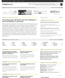
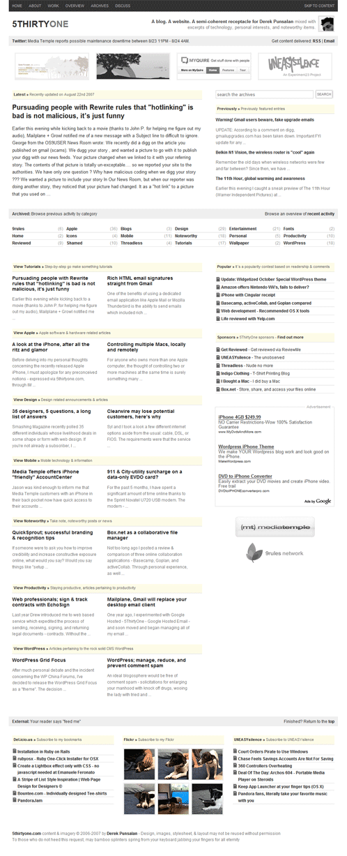
5ThirtyOne, Derek Punsalan
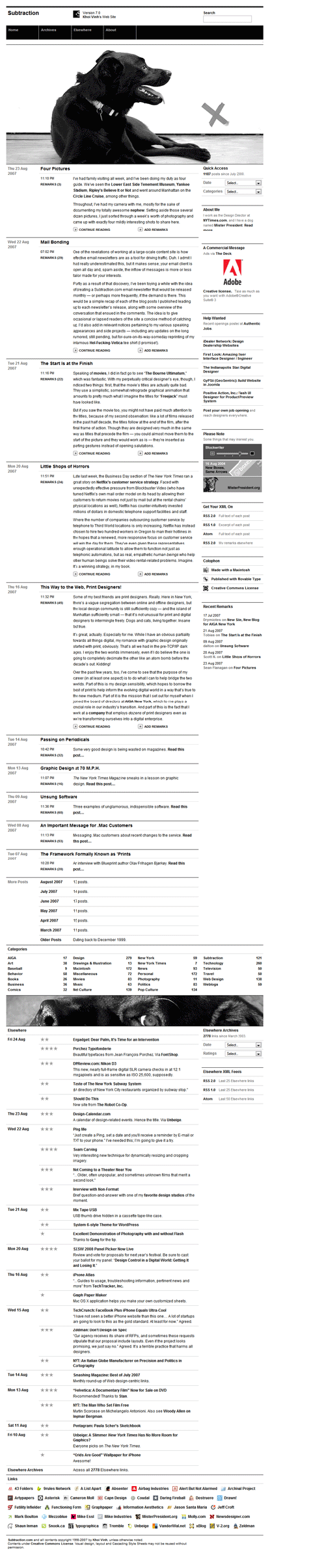
Subtraction, Khoi Vinh
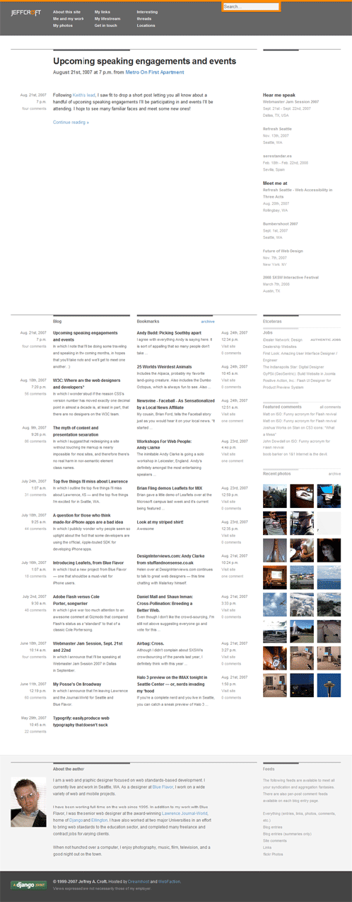
Jeff Croft
Mark Boulton
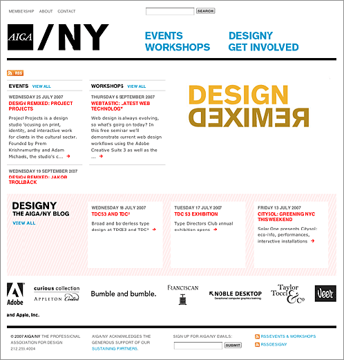
AIGA/NY
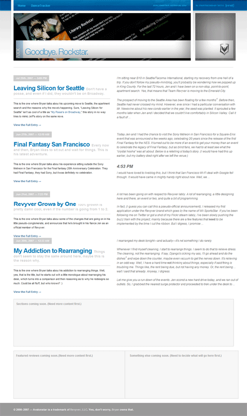
Avalonstar, Veloso
.
Originally posted on August 27, 2007 @ 2:11 pm