TechCrunch announced the Ustream.tv redesign yesterday, and after having a look at it I’m left with a few questions. The new design is definitely an improvement (I won’t fight that) and looks much more mature than the previous version, which seems great for their target market. But it still seems a little rough around the edges.
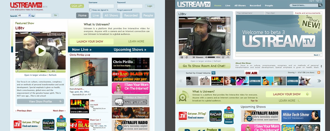
First off, a look at the design from a couple days ago along with the new site design:
Oh, and I’m not even sure what to think about the Validator’s response to the new site. Where to begin?
The Flow
One of the first things I noticed was the way the “About this Show” paragraph is tucked away off to the right of the video it’s talking about. It’s uncomfortable. Then there’s the fact that the tiny two line display (ouch) has little arrows to the right to navigate up and down the description. I guess it goes to show how important the video’s description is, doesn’t it?
A little pet peeve of mine: I should know what your site (especially Web 2.0 application sites) does within two seconds of landing on the page. Make it stand out by describing it in three words if you have to (it’s worked on other video sites). And Ustream’s concept is so much better than other video sites, their edge is sharp, you would think they would want to flaunt it. Instead the “What is Ustream?” bar is so far down the page it’s almost below the fold! I’d be curious to hear their reasoning for 600 pixels down rather than right up top.
Maybe I’m not getting the style choice on this, but the “Popular Streamers/Popular Recorded” bars at the bottom seem…off. Maybe it’s supposed to look like the background repeated in the wrong place, but if that’s the case it doesn’t look cool.
Interactive?
One of the biggest points Nick made in the TechCrunch post was that Ustream made these changes to become more interactive. He references the Shout Meter, the Gallery Mode for browsing, and the Pulse Polls in particular. My criticism is much simpler than all of those things: where are all the rollovers?
In the top navigation there is a heavy rollover effect. Let’s face it, a rollover that actually produces a gradient is pretty intense. But then there are buttons that don’t have rollover features at all, some of which are extremely important buttons. Check out:
- the “Go To Show Room And Chat” button,
- the arrows on either side of the gallery browser, and
- the “Learn More” button,
none of which have rollovers at all. Granted, there are a lot of cool rollover effects throughout the page (the description given for the Shout Meter, for example) but that shouldn’t be an excuse for limiting usability in a much simpler way.
Clashing Corners
On an aesthetic level, the way round edges butt up against hard edges makes me wonder. The page is bound in round edges, and many of the turns on the inside of the page are as well. But then the “Welcome to beta 3” announcement has sharp edges. I wonder whether it was intended or whether it’s actually an oversight.
I also wonder whether there were so many color schemes available they just decided to use a couple of their favorite. The top half of the screen looks like one color set, whereas the bottom looks very different. I actually prefer the bottom half more than the top (has more of a collegiate feel) but I would have liked to see some more consistency.
Compare/Contrast
We can’t help but compare this redesign to Ustream’s direct competition Stickam, which sports a design much more like the old Ustream than the new (especially the login/search area at the top). But Now I think Ustream is trying to propel itself into a different style of video website, moreso that created by sites like Vsocial and Vmix. I wonder which site they took more of the influence from. Also, notice the striking similarities between their search bar and Apple’s classic search. Pretty close, eh?
I’m left wondering whether Ustream wants to be a part of the crowd or stand out. The old and new design side by side are, in my book, pretty much equal.
This post was written by Ryan Imel, who also blogs about WordPress Plugins and themes at Theme Playground.
Originally posted on July 26, 2007 @ 10:35 am