Wisdump

Dumping wisdom on design and the web

  • Home
  • Best of Wisdump
  • Advertise
  • About
  • Contact Us

A Nice Sidebar Design

Blog Perfume’s sidebarWith all the sidebar (and footer) bashing I’ve been doing lately, I thought I’d share a nice sidebar design with you, and tell you why I like it.

Enter Blog Perfume, which has a decent design overall, clean and sober, yet modern and with things happening. I’m no fan of the header, the background makes it a bit too busy, but other than that it’s nice enough. Also, the search bar needs to pop more.

And the sidebar is great.

On top, the subscribe graphic, precisely where you expect it to be.

Under that, a nice two column categories menu, with a separate background plate to really stand out. It works well with the Feedburner flame in the subscribe graphic above, very nice.

Two ads follows. I see them, they don’t annoy me.

Then the sidebar gets a little more anonymous, something I think is on purpose. Light grey boxes for popular posts and recent comments (which has an overuse of bold type, unfortunately) offer deep linking to the readers, and they do it in a sober and clean manner.

Finally, there’s a bigger square ad at the bottom. I think it’s OK to end the sidebar with a bigger ad, I have no problems with that. On this particular occasion, all ads fitted the layout nicely as well.

Watch and learn, people. No crappy widgets, just clean functionality for the readers, and the necessary ads. A good utilization of the sidebar.

Originally posted on December 8, 2007 @ 12:38 am

Battle of the Pointless Services

They are all the rage right now. Everybody uses them. They are being blogged about every day. Hell, people feature them in their sidebar! I am of course referring to those incomprehensible “update” services. Twitter and Pownce are the major players in this market; the two real powers. One the established giant (if such a thing exists) and the other, the new up and coming underdog (Rocky anyone?). But what are they battling over?… Your thoughts.

The Psychology Behind The Service

What is it about sharing your thoughts that ultimately makes this a viable idea? I mean, honestly, I don’t personally find these things appealing; but I think I can see where some people would. It plays into our inner most desires to be seen and heard. We want to broadcast our thoughts because somehow we think that we are important; that we matter. Whether we do or not is a question for open debate, but with Twitter and Pownce, you can feel as important as you think you are.

Now, I kind of think that these types of services are redundant; I thought that there were already features in other services that filled these needs. Think of MySpace and its headlines or Facebook with its status updates. Doesn’t that cut the mustard? I mean, even though Pownce has more features than just thought sharing, it definitely doesn’t have anything that social networking sites don’t already have… But hey, who am I to question the usefulness of two of the web’s most popular services?…

Are You A Twit?

Let’s take a look at Twitter’s design, shall we? Well, my initial first impression was, “Wow, it looks like some of those Web 2.0 generators threw up in here.” You’ve got your vibrant blues and greens, with a lackluster menu and a bubbly logo. What more do you need, right?

Twitter

Well, beneath its quintessential web 2.0 exterior beats the heart of a simple, direct, useful service (if, of course, you find the idea behind it useful). It is as if a minimalist and a utilitarian got together and worked on this website. It needs no instructions. Everything is obvious and to the point. It has only the one feature and the design does nothing to get in its way.

Sure, it doesn’t suit my taste, but I cannot fault it for not hiding away features and not complicating its menu. And if anything, the logo was a bit ahead of its time. It nailed the principles behind whatever web 2.0 is; it is looked upon as a standard now, and must be given credit for that.

Do You Prefer To Pownce?

For me, Pownce is a fantastically designed site. One for the CSS galleries of this world. There isn’t much I don’t like about this look; the logo, the color scheme, the layout. It all works in my book. In fact, I would say that the focus of the site is the design; which is quite the problem in and of itself.

Pownce

You log in and see a welcoming, warm environment. And if it isn’t warm enough for you, Pownce offers 4 different themes for your profile; all of which are well designed. But we should also look past the design. And that is now small task. The basic functionality is easy enough to use though, and while some features are a little bit more cryptic, there is nothing too difficult to find or use.

Speaking of those features, there is a laundry list of them. Pownce does much more than just share your thoughts. You can post images, files, links, build a comprehensive profile, and we haven’t even gotten to the desktop companion yet. But is that too much? Do you really need all of that in this sort of service? I, for one, do not think so.

Who Will Come Out On Top

The idea behind both of these services is very simple; share your thoughts. And Twitter gives you what you need and nothing more. Share your thoughts with your friends and be done with it. On the other hand, Pownce does this and much more. With all of its features, I feel like its reaching too far. Don’t get me wrong; I was pumped to get my beta invite and try out this much hyped service. But in the end, Pownce comes off more like a half assed social networking site than anything else. These services should be competing on the basis of what they are supposed to be; they should not try to mimic what they are not. For now, Twitter is king (Alexa rank of 636) and I see it staying that way. Pownce (Alexa rank of 3780) may seem like a challenger, but the novelty of its myriad of features runs out fairly quickly.

Originally posted on October 22, 2007 @ 12:50 am

New Look Lounge And List

Two of the best looking websites recently changed their look. Devlounge and Ordered List have been leaders in the blogging community for some time. But that is not all they have in common; they are also both 9Rules defectors. However, I do not want to dwell on that, because it will only lead to trouble. Anyhow, these two popular sites have been refreshed and I would like to take a look at the new looks of each of them.

Devlounge and Ordered List

Ordering Up A New List

Steve Smith’s Ordered List has been one of my personal favorite designs since I began blogging. His black and blue color scheme with subtle highlighting was fantastic. Well, now all of that is gone, but let me be the first to say that I love the new look.

The motivation behind the redesign was actually to enhance the business aspect of the site. He has deemphasized the blog while enhancing the exposure of his personal company. Of course, besides the shift in the site’s philosophy, he also refreshed the look. A new brown color scheme is the most obvious change. If you would have said that it was going to be brown, I probably would have thought it was going to look terrible, but Steve pulled it off. He also subtly realigned elements, which makes sense for his new business orientation.

Ordered List

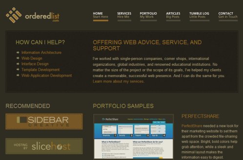
The only thing that was changed about the logo was the color scheme. Interestingly enough, I noticed that the logo was actually an unordered list, not an ordered list… But, it is still a great logo, conveying the basic idea about its namesake.

On a typographical note, I am a big fan of the way his actual posts look. The large font of the opening paragraph with the subtle line beneath really set it apart. It also helps to draw the reader in to the article. Additionally, there is a refreshing lack of advertisements. In fact, he doesn’t even have a sidebar, leaving all of the focus on the article, which is presented in a very easy to read font. Overall, the redesign is great.

Relaxing In The Lounge

The folks over at Devlounge have utilized a major technique that we preach about here at Wisdump; whitespace! That’s right, they have cleaned up their look and reemphasized their content. But somehow it still leaves something somewhat lacking.

Don’t get me wrong, I like the overall look. Yet I can’t help but notice that it seems like a bit of a step backwards, whether that was their intention or not. It resembles their previous look to a strong degree. I know that isn’t a bad thing, but I just feel slightly cheated. Again, I like the look, but a part of me is somehow slightly resentful.

Devlounge

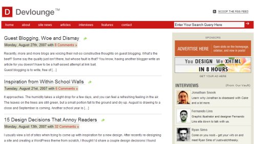
As I mentioned before, their content has become the focus. Everything has been simplified; there are no distracting elements and advertising is at the bare minimum. There is a distinctive lack of graphical elements, which is impressive, because the site still has a tremendously professional feel. Again, this redesign was more about removing things than it was about changing or adding things. It is a quintessential grid design.

Personally, I would have preferred to see a tweaking of their previous design. I liked the artistic flair of the banner and I also thought that the magazine layout of the homepage was interesting. It was a bit complicated to navigate, but I thought it really stood out. So some enhancements would have been preferable for me, yet overall, I still like their new design.

This article was written by J David Macor.

Originally posted on September 12, 2007 @ 7:12 am

Fun With Design: “In Case You Missed These”

Sometimes design is funny. Or, at the very least, commentary on said design is funny. Check these out, in case you missed them.

NYT on Windows Vista

David Pogue in a YouTube clip explaining (sarcastically, in case you miss it) that Windows Vista is nothing like Mac OS X. Ignore the flurry of useless comments below it and you may have a good laugh.

Vista and OS X

(NYT is blocking the embed on this one, visit YouTube to watch.)

Wii Safety: The Missing Manual

First, check out this post on the near-comic pages and warnings from the Japanese Wii Safety Manual. That would seem good enough, sporting images like this one:

Image from the Wii Safety Manual in Japan

A Flickr set was started by The Iconfactory with hypothetical images for what was called “The Missing Pages” of the Wii Safety Manual. The first time I saw the group I laughed so hard I cried.

Image from “The Missing Pages” of the Wii Safety Manual Flickr Group

Originally posted on October 29, 2007 @ 2:47 pm

Top Heavy Designs

The layout of a design leads the reader through a web page. It guides your eyes down a page and hopefully you end up at the content. The question is, how long does or should it take for you to get to the content? Well, to a degree, this should depend on the type of website you are designing, but I want to focus on blogs here. Now, every meta-blogger out there will scream to the heavens that content is king, but I am seriously beginning to doubt that assertion. The real goal of a blog is to increase readership, regardless of content.

Of Course They Want More Readers

Fair enough. But think of how classic blogs were designed. They had their title, with a menu on the left and then a long list of posts; the content was the focus. Then came this fat header design trend, whereby a large header image or graphic was used at the top. It took away the focus slightly, but being solely a design element, a reader would eventually make it back to the content a few inches below.

However, now we are seeing more content in the actual header. Header’s have become more than design elements; they are now useful beyond just being a clever place for an extremely zoomed in photo of your eye. More and more things are appearing in the header; above the proverbial fold. But is that really a good thing?

What Are They Stuffing Up There?

What isn’t being stuffed up there? Seeing search boxes or menus is nothing surprising; even the odd RSS icon is fine. But links to recent or popular articles, newsletter subscriptions, affiliates; is that going too far? Lets take a look at 4 examples:

Better For Business

Josh Mullineaux dot Com

John Chow dot Com

Nate Whitehill dot Com

These examples come from Better For Business, Josh Mullineaux.com, John Chow.com, and Nate Whitehill.com. All of the afore mentioned elements appear in each of these examples above the fold. Things like links to other posts, subscription options and so forth used to be sidebar elements. They even were considered appropriate for the ever popular fat footer (still a trendy place for Flickr photos and the like). Now the thinking has changed.

But Wait! Isn’t The Content Still King?

Those elements still take you to some form of the authors content. But to a degree, it breaks the flow of a traditional blog. It puts the very best the author has to offer in your face, and above all asks you to become a regular reader. I don’t necessarily think that this is a mistake; in fact, I myself am experimenting with this type of technique. Nevertheless, it still represents a bit of a shift in the makeup of a blog. Now you don’t have to wait day to day for the best articles and then decide whether you want to be a reader; you are bombarded with the author’s A-game and then asked to make a decision on the spot: subscribe or move on!

This post was written by J David Macor.

Originally posted on August 29, 2007 @ 1:22 pm

« Previous Page
Next Page »

Categories

3 Things You Can Do To Move Up In Your Search Rankings

SEO Tips For Your Digital Marketing Campaign

Web Design Tools You Wish You Knew About When First Designing Your Website