The layout of a design leads the reader through a web page. It guides your eyes down a page and hopefully you end up at the content. The question is, how long does or should it take for you to get to the content? Well, to a degree, this should depend on the type of website you are designing, but I want to focus on blogs here. Now, every meta-blogger out there will scream to the heavens that content is king, but I am seriously beginning to doubt that assertion. The real goal of a blog is to increase readership, regardless of content.
Of Course They Want More Readers
Fair enough. But think of how classic blogs were designed. They had their title, with a menu on the left and then a long list of posts; the content was the focus. Then came this fat header design trend, whereby a large header image or graphic was used at the top. It took away the focus slightly, but being solely a design element, a reader would eventually make it back to the content a few inches below.
However, now we are seeing more content in the actual header. Header’s have become more than design elements; they are now useful beyond just being a clever place for an extremely zoomed in photo of your eye. More and more things are appearing in the header; above the proverbial fold. But is that really a good thing?
What Are They Stuffing Up There?
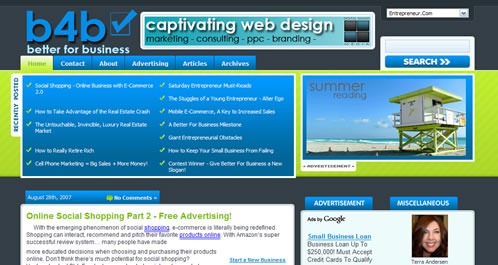
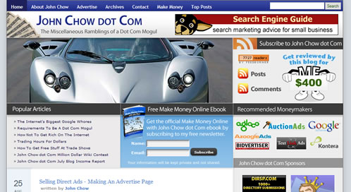
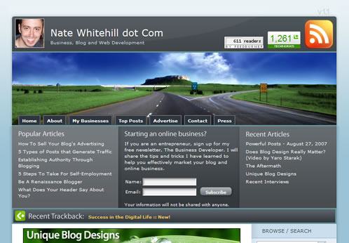
What isn’t being stuffed up there? Seeing search boxes or menus is nothing surprising; even the odd RSS icon is fine. But links to recent or popular articles, newsletter subscriptions, affiliates; is that going too far? Lets take a look at 4 examples:
These examples come from Better For Business, Josh Mullineaux.com, John Chow.com, and Nate Whitehill.com. All of the afore mentioned elements appear in each of these examples above the fold. Things like links to other posts, subscription options and so forth used to be sidebar elements. They even were considered appropriate for the ever popular fat footer (still a trendy place for Flickr photos and the like). Now the thinking has changed.
But Wait! Isn’t The Content Still King?
Those elements still take you to some form of the authors content. But to a degree, it breaks the flow of a traditional blog. It puts the very best the author has to offer in your face, and above all asks you to become a regular reader. I don’t necessarily think that this is a mistake; in fact, I myself am experimenting with this type of technique. Nevertheless, it still represents a bit of a shift in the makeup of a blog. Now you don’t have to wait day to day for the best articles and then decide whether you want to be a reader; you are bombarded with the author’s A-game and then asked to make a decision on the spot: subscribe or move on!
This post was written by J David Macor.
Originally posted on August 29, 2007 @ 1:22 pm


