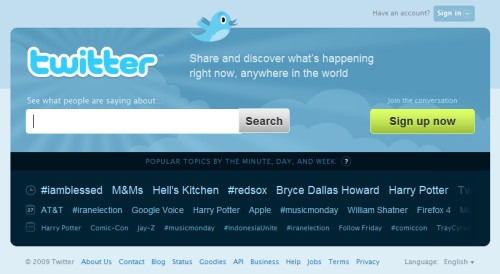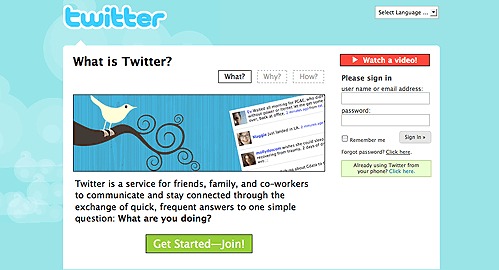
Twitter definitely upped its game as its new homepage rolled out today (viewable only if you’re logged out). Now its greatest strengths are featured front and center: real-time search and trends. A wise upgrade no doubt, but there’s something off about the design.
On any other website I wouldn’t have been bothered by this. A fair amount of blue, green, gradients, rounded corners, and overall sleekness reminiscent of a certain OS: these are all “acceptable” characteristics of good web design these days. The problem is, this is not what Twitter is about.

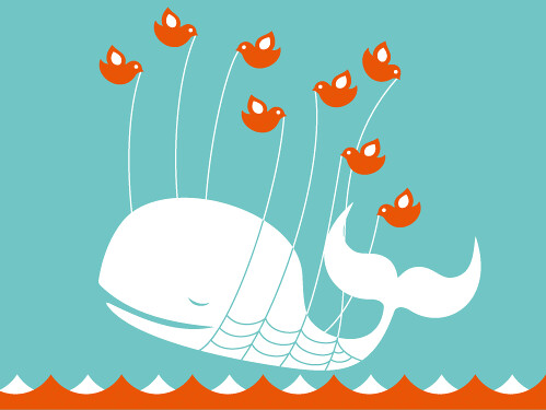
To me, Twitter is warm, organic, friendly—all because of the homepage (and the Fail Whale, of course). Sure, it used stock illustrations instead of commissioning original ones, but they were distinct enough. None of the cliche sunbursts and clouds, or the decidedly safer shades of blue.
And just as Twitter exploded in popularity, so did its branding. There’s an official Twitter bird, but whenever I see any other illustrated bird—hawk, owl, or any other kind—I think of Twitter. Heck, when I see that almost distinct light shade of blue (forget Tiffany & Co.!) or a rounded typeface, I think of Twitter. And while LOLcats have cemented their meme-dom for a while now, it’s really Twitter that shot them to stardom when they were used as error messages on the site.
Sure, all these inside jokes, cutesy mascots, and pastel hues may seem immature to some, and maybe the higher-ups thought it was time to get Twitter a personality makeover. What did they replace it with, exactly? tweaked Web 2.0 slash Apple design elements? Try again.
The old design elements fit Twitter’s image of sheer simplicity, of 140-character answers to the question “what are you doing?”. And today, with the homepage redesign, that image has started to slip away.
Originally posted on July 29, 2009 @ 2:33 pm
