Often overlooked and misunderstood, typography stands, to many, as one of the least interesting aspects of design. Plenty of us have a predetermined collection of 5 or 6 fonts that we always choose from; a go-to pool of familiar looks. We let default line heights rule the roost. However, by expanding the breadth of our typography knowledge, we can truly reshape and characterize our design. In fact, I can think of 3 principle benefits of the mastery of this topic:
- Improved Readability
- Professional Touch
- Unique Feel
To put it simply, you will become a better designer. Typography influences every far reaching facet of web design: banner, menu, logo and content to name a few. It doesn’t get too much more all encompassing than that. In fact, some have gone so far as to say that web design is 95% typography.
The Basics
The Basics of Typography: What better place to start than from the beginning? This 3 part series serves as a great introduction to typography. The articles touch on everything from terminology (is a font different from a typeface?) to paragraph widths (learn about the alphabet method).
Thirteen Ways of Looking at a Typeface: Michael Bierut examines the previously mentioned notion that designers should stick to a small collection of fonts and discusses its faults. He then addresses the proverbial question in typography: why choose a particular typeface? Well, he gives you 13 reasons.
The Typography Timeline: Why not sharpen your knowledge on the subject with a little bit of history? Jim Kidwell found this nifty timeline of typography in the 20th century. The chart is extremely interesting and worth a look through.
Techniques
Soft Serve: This article addresses an often misunderstood aspect of font-sizing: absolute versus relative. Daniel Mall walks the reader through the techniques involved and gives you a good sense of where to start when it comes to font size specification.

Typography in Logo Design: The folks at SOS Logo design walk you through the essentials of typography in designing a logo, while touching on text manipulation and symbol usage. While not incredibly intricate, the article presents the basic techniques and ideas you should consider.
The Trouble With EM ’n EN (and Other Shady Characters): It is tough to discuss an aspect of web design without referring to ALA; and indeed I could not avoid it. Here, Peter Sheerin talks about the various symbols in HTML and their proper usage. This article is a must read.
Tools
What The Font?: I can’t even count the number of times where I have seen a logo and wondered, “What font is that?” Well, luckily there is a service that you can use to identify fonts within images. You upload and let it tell you what font you have on your hands.
Baseline Rhythm Calculator: The idea behind this tool is simple. Pick your font size and your line height, then let the tool generate some nifty CSS for your usage. That’s all folks.
Typeface Cheat Sheet: The oh so Digg worthy Thinking Blog gives us this gem. It comes from Alessandro Segalini and it is essentially a font mixing grid. It will help you decide on which combination of typefaces to use, which is very handy.
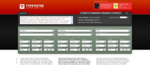
Typetester: This tool allows you to test different type faces; imagine that. You have three columns of text and you can modify the typography anyway you please and then get the accompanying CSS for your choices. It is great for comparing and mixing fonts.
Conclusions
This is by no means a completely comprehensive anthology, so feel free to leave a comment about your favorite resources. Overall, I am just trying to get this message across: there is a great deal for all of us to learn about typography. Its importance is overwhelming in the design world. It predates our digital era and it will certainly last much longer than that. Hopefully you will take it upon yourself to refine and rethink your typography choices.
This article was written by J David Macor.
Originally posted on September 5, 2007 @ 6:00 am