Wisdump

Dumping wisdom on design and the web

  • Home
  • Best of Wisdump
  • Advertise
  • About
  • Contact Us

Whet Your Appetite with These Tasty Recipe Site Designs

July 27, 2011 By

Recipe sites have this tendency to cram so much stuff on their pages that instead of being helpful, they get in the way of finding the perfect dish for that meal you’re planning. These sites, however, are redefining the culinary experience by providing beautifully-designed and user-friendly experiences on the web, and hopefully in your kitchen.

Gojee

Gojee website

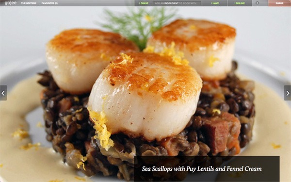
Gojee is all about personalization: you have to be signed up to their website to take advantage of its features. Enter the ingredients you “crave”, “have”, and “dislike” to get a list of handpicked recommended recipes, whose photos are displayed in full. You can browse back and forth using the arrows on either side of the page, or the arrows in your keyboard—the up and down arrows toggle recipe details at the bottom right. The use of translucency and large imagery gives a stylish, high-end feel to the site.

Recipe Finder

Recipe Finder website

Recipe Finder takes the Google approach to finding recipes through a minimal search engine interface with an almost playful look between its cartoon logo, polka dots, and stripes. You have the option to view recipe results as text or images, and narrow them down with advanced filters. Meta information such as calories, servings, and preparation time are also listed.

Recipefy

Recipefy website

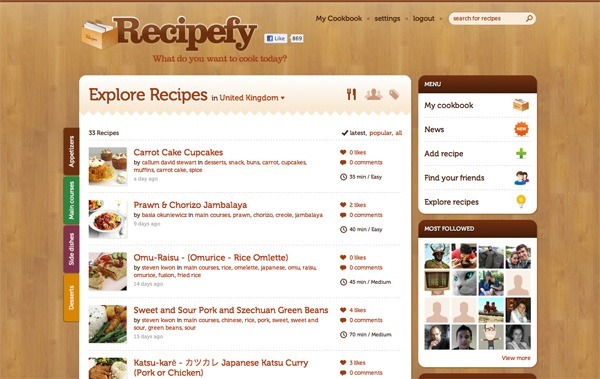
Recipefy is built on the contributions of its community and other social aspects, like inviting friends and following fellow users. You can explore recipes with the color-coded tabs on the left side, and the icons to the right of the page heading, then like or add them to your own cookbook. The woodgrain background and warm color palette definitely gives the site a homey vibe.

[Read more…]

Filed Under: design for poor motor control

David DeSandro’s guided portfolio & new-age image map

May 18, 2010 By

David DeSandro portfolio

Aside from creating brilliantly art-directed articles that push the limits in with the latest HTML and CSS features, David DeSandro is redefining at least two classic site features at the same time with his Portfolio page:

The portfolio format.

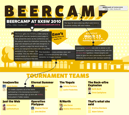
Most portfolios consist of image thumbnails with either short or detailed descriptions about each project undertaken. DeSandro’s portfolio, on the other hand, contains full-width, full-height screenshots with guided markings explaining the how and why of his work, not just the what. Not only can you admire and drool over the designs, but you can learn from them as well.

The HTML image map.

The concept of image maps is sound but its execution isn’t so exciting: you don’t exactly know where to click and if you do, you don’t know what you’re clicking on. DeSandro created annotations that are intuitive and easy to navigate.

Does your portfolio need a refresh?

Your portfolio is your resume. Presenting your work and communicating your design view is critical to how others perceive you and shouldn’t be an afterthought. David’s portfolio isn’t so complex as it is well thought out. The designs are in full view; the details are straightforward. No distractions, no hype. Reexamine your portfolio page and see if yours is the same.

Filed Under: design for poor motor control Tagged With: online presence

Pitchfork.tv Splash Page Bring It

March 7, 2008 By

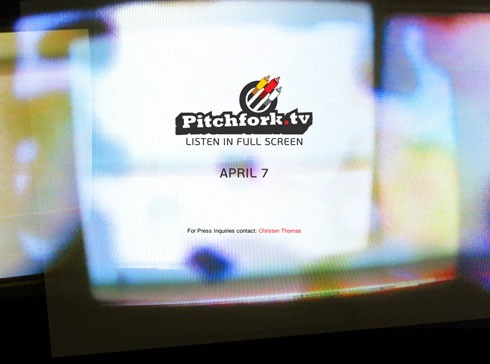
Indie music site Pitchfork will launch a music web TV channel (or whatever you want to call it) on April 7. The splash page for this channel is great:

pitchforktvsplash.jpg

[Read more…]

Filed Under: design for poor motor control

Design Critique: Read/WriteWeb

January 25, 2008 By

Read/WriteWeb is a great site, content-wise, I read it from time to time – I especially like Marshall Kirkpatrick’s writing style. Actually, all sites in the RWW Network, being Last100 and AltSearchEngine, as well as the podcast Read/WriteTalk, all reek of quality. That’s nice.

What’s not as nice is the design the flagship site, Read/WriteWeb sports. It’s a fairly new one, and a real downgrade if you ask me. I’ll tell you why.

[Read more…]

Filed Under: design for poor motor control

A Nice Sidebar Design

December 8, 2007 By

Blog Perfume’s sidebarWith all the sidebar (and footer) bashing I’ve been doing lately, I thought I’d share a nice sidebar design with you, and tell you why I like it.

Enter Blog Perfume, which has a decent design overall, clean and sober, yet modern and with things happening. I’m no fan of the header, the background makes it a bit too busy, but other than that it’s nice enough. Also, the search bar needs to pop more.

And the sidebar is great.

On top, the subscribe graphic, precisely where you expect it to be.

Under that, a nice two column categories menu, with a separate background plate to really stand out. It works well with the Feedburner flame in the subscribe graphic above, very nice.

Two ads follows. I see them, they don’t annoy me.

Then the sidebar gets a little more anonymous, something I think is on purpose. Light grey boxes for popular posts and recent comments (which has an overuse of bold type, unfortunately) offer deep linking to the readers, and they do it in a sober and clean manner.

Finally, there’s a bigger square ad at the bottom. I think it’s OK to end the sidebar with a bigger ad, I have no problems with that. On this particular occasion, all ads fitted the layout nicely as well.

Watch and learn, people. No crappy widgets, just clean functionality for the readers, and the necessary ads. A good utilization of the sidebar.

Filed Under: design for poor motor control, freelance writing Tagged With: apps, internet, online presence, speech and trolling

Next Page »

Categories

Web Design Tools You Wish You Knew About When First Designing Your Website

Best Resources to Use for Web Design Ideas

The “Horrible Web Design Client:” An Infographic Look