Wisdump

Dumping wisdom on design and the web

  • Home
  • Best of Wisdump
  • Advertise
  • About
  • Contact Us

Forget About The Fold: Skysports Redesign, Less Is Less.

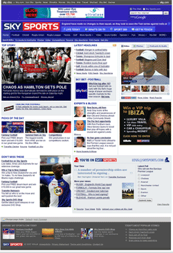
Skysports Homepage smallWhen Skysports launched their redesign 2 weeks ago, they’ve forgotten one thing. The new CSS-based design is visually appealing, and contains everything one expects from a modern news portal. Enough of whitespace, integrated social bookmarking links and comments. But it lacks in one area: usability.

While the page height has been drastically reduced all over the platform, it has become much harder for the reader to easily navigate the platform. The old homepage was only 400 px higher, had less whitespace, but offered more.
Before, your typical nuke left sidebar offered many different configurations, depending on where you were on the side. The left sidebar has been replaced with a modern header navigation, but a header navigation with some elements in a JS drop-down navigation and other elements in dropdown boxes. More clicks for the user.
On the main and section pages less stories are listed, thus making navigation for people interested in headlines harder.
Bad become both problems on the subpages. Obviously the most popular sport for Skysports, football – soccer for Americans and Beckhams – is the best example of this. Many leagues and headlines were listed on the former football page and the old fashioned left navigation bar offered a quick navigation to the different league pages. Today only some headlines and stories are linked anymore and the leagues have disappeared in a dropdown box.

The design team of Skysports has done a visually appealing job but forgotten that there is no fold! Internet surfers are used to scroll pages nowadays and the great article Blasting The Myth Of The Fold, by Milissa Tarquini, Director of User Interface Design and Information Architecture at AOL, proves that not everything has to be stuck in the little area above the fold, with a practical example: on the 2500px high, now retired, AOL News Daily Pulse one poll at the bottom of the page had more than 325k votes!

Footer design has become a very important part of actual webdesign. Many navigational items are nowadays found in footers. Give the reader something when they arrive at the end of the page. They have thought about a footer area, but the footer can heavily be improved with useful content.

Clearly the Skysports designing team has missed the last 12-18 of web design evolution. Maybe someone can pitch them Roger Johansson’s 456Bereastreet. They might as well learn that the propagation of horizontal design implementation of horizontal scrollbars doesn’t improve the accessibility of any site.

The Skysports redesign, a perfect example of how modern design could make your site less usable.

Originally posted on August 14, 2007 @ 3:39 pm

Side by Side: The Ustream.tv Redesign

TechCrunch announced the Ustream.tv redesign yesterday, and after having a look at it I’m left with a few questions. The new design is definitely an improvement (I won’t fight that) and looks much more mature than the previous version, which seems great for their target market. But it still seems a little rough around the edges.

First off, a look at the design from a couple days ago along with the new site design:

Ustream.tv Side by Side

Oh, and I’m not even sure what to think about the Validator’s response to the new site. Where to begin?

The Flow

One of the first things I noticed was the way the “About this Show” paragraph is tucked away off to the right of the video it’s talking about. It’s uncomfortable. Then there’s the fact that the tiny two line display (ouch) has little arrows to the right to navigate up and down the description. I guess it goes to show how important the video’s description is, doesn’t it?

A little pet peeve of mine: I should know what your site (especially Web 2.0 application sites) does within two seconds of landing on the page. Make it stand out by describing it in three words if you have to (it’s worked on other video sites). And Ustream’s concept is so much better than other video sites, their edge is sharp, you would think they would want to flaunt it. Instead the “What is Ustream?” bar is so far down the page it’s almost below the fold! I’d be curious to hear their reasoning for 600 pixels down rather than right up top.

Maybe I’m not getting the style choice on this, but the “Popular Streamers/Popular Recorded” bars at the bottom seem…off. Maybe it’s supposed to look like the background repeated in the wrong place, but if that’s the case it doesn’t look cool.

Interactive?

One of the biggest points Nick made in the TechCrunch post was that Ustream made these changes to become more interactive. He references the Shout Meter, the Gallery Mode for browsing, and the Pulse Polls in particular. My criticism is much simpler than all of those things: where are all the rollovers?

In the top navigation there is a heavy rollover effect. Let’s face it, a rollover that actually produces a gradient is pretty intense. But then there are buttons that don’t have rollover features at all, some of which are extremely important buttons. Check out:

  • the “Go To Show Room And Chat” button,
  • the arrows on either side of the gallery browser, and
  • the “Learn More” button,

none of which have rollovers at all. Granted, there are a lot of cool rollover effects throughout the page (the description given for the Shout Meter, for example) but that shouldn’t be an excuse for limiting usability in a much simpler way.

Clashing Corners

On an aesthetic level, the way round edges butt up against hard edges makes me wonder. The page is bound in round edges, and many of the turns on the inside of the page are as well. But then the “Welcome to beta 3” announcement has sharp edges. I wonder whether it was intended or whether it’s actually an oversight.

I also wonder whether there were so many color schemes available they just decided to use a couple of their favorite. The top half of the screen looks like one color set, whereas the bottom looks very different. I actually prefer the bottom half more than the top (has more of a collegiate feel) but I would have liked to see some more consistency.

Compare/Contrast

We can’t help but compare this redesign to Ustream’s direct competition Stickam, which sports a design much more like the old Ustream than the new (especially the login/search area at the top). But Now I think Ustream is trying to propel itself into a different style of video website, moreso that created by sites like Vsocial and Vmix. I wonder which site they took more of the influence from. Also, notice the striking similarities between their search bar and Apple’s classic search. Pretty close, eh?

I’m left wondering whether Ustream wants to be a part of the crowd or stand out. The old and new design side by side are, in my book, pretty much equal.

This post was written by Ryan Imel, who also blogs about WordPress Plugins and themes at Theme Playground.

Originally posted on July 26, 2007 @ 10:35 am

Side by Side: The New ProBlogger

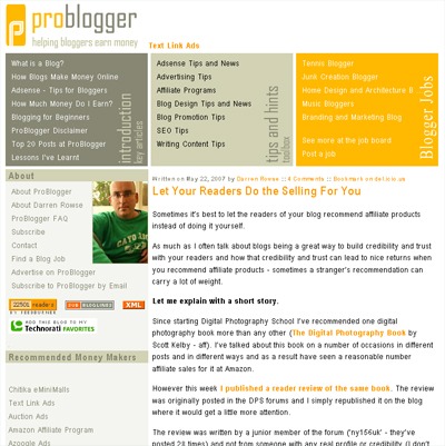
I’m a big fan of Darren’s ProBlogger. I wouldn’t read it as often as I do if I wasn’t. So it struck me as interesting when he recently launched a complete redesign of his website. When someone in the top 5,000 does that, it’s time to stand up and take notice.

That’s what I’ve done. Let’s take a look at the old ProBlogger and the new, side by side.

ProBlogger Logo Comparison

The color change is a strong one, but only in the way that this new logo really jumps out at you in a way the old one didn’t. I tend to see that as a good thing, some see it as bad. Overall I would say the logo is a good one, and it’s interesting that it puts a bit more emphasis on the “Blogger” in the name than the “Pro”.

Weekly Video Post

I can tell right now that it’s going to get a little frustrating seeing some form of mangled frame-face each time I visit ProBlogger’s home page now. I suppose I’ll get used to it.

ProBlogger Weekly Video Post

Overall Layout/Design

ProBlogger before the redesign

ProBlogger after the redesign

I can’t help but wonder whether or not this new layout is all that unique. Granted, it’s three column and breaks the 800px wide barrier, so it’s clear that the target audience has shifted a bit. But how much of a shift does the redesign show happening?

Take, for instance, the photo of Darren displayed prominently on the old ProBlogger. Now, it’s tucked away way below the fold, really beyond the point of even mattering. In essence, he has removed himself, visually, from the site. Does this turn suggest that ProBlogger will be written by more than himself in the future? Maybe not right away, but that time certainly could be approaching.

Search Bar Prominence

It’s interesting to me how the search bar gets (arguably) #1 priority by being up top. I’m used to seeing search bars on blogs much lower down on the page (TechCrunch, for instance) but hardly ever up top anymore. It makes me wonder if it was a conscious design choice or just put there because it fit and the space was available.

Content’s Position on the Page

I do like how the new ProBlogger places content much higher on the page than the previous version did. I don’t like when I have to scroll down (on the single post view, even) just to see the content. So I’m glad that was taken care of.

Height of the Home Page

The method of choice for cruising ProBlogger has slightly shifted as well. The old home page used to have ten full posts (or previews) available on the home page to be scrolled. The new design limits the height and the number of posts to seven, and of them only summaries are displayed. I can’t help but be reminded of when Daily Blog Tips shortened the posts on its front page from their full length to excerpts. That received a good amount of criticism as well, and I would say that’s because people like browsing full entries on the home page of a blog. Personally, the first time I check out a blog, I do one of two things.

  1. First, I can decided (usually) right away whether I want to subscribe to a site just by reading the first post I see. In that case, I add it Feedreader and skim through the most recent posts that way.
  2. On the other hand, if I don’t know whether I like it or not I’ll page down on the home page to see what else is there.

The reason for this long digression is to say that the new ProBlogger doesn’t allow for the lazy-scroll browsing the way the old one did. Granted, the cool little “popular” box in the middle of the page is nice, but I don’t know that it carries the same effect.

Honestly, I don’t believe that many blogs could survive the switch that ProBlogger has made. Most blogsites need a format that encourages browsing and pushes it to the forefront. ProBlogger must not.

(Note: You can have the lazy-scroll browsing if you want. Just click through to the “blog” from the ProBlogger home page.)

This is what makes me wonder if ProBlogger isn’t headed away from the traditional blog setup. It’s already taken one step, so it may just be a matter of time. I mean, it already looks like a network site, doesn’t it?

Originally posted on August 13, 2007 @ 11:33 am

The Beauty of Sketch Design

Sketch Design is what I call it when a web designer uses techniques that go beyond standard web graphical elements. Your standard elements are buttons and banners that generally try to mimic a real world texture, whether it be plastic or glass or something along those lines. This is a tried and true technique that is certainly the one that I employ the most. However, a newer breed of designer is using a more classic technique.

More Artist than Web Designer

To be a sketch designer, you need to have artistic skill: be able to draw and sketch and have a masterful understanding of color. Contrast that with a standard web designer who finds color palettes, instead of creating them, and who can’t sketch a stick figure, much less anything more complex. If you really think about it, a basic web design is nothing more than a glorified set of rectangles. A sketch design breaks the boundaries of grids, while keeping all of the content elements in focus. To achieve this effect, the designer must be highly skilled and knowledgeable in how to layout a design, such that if the artistic flare wasn’t there, the content would still make sense (obviously, standards play a key role here).

Enough rambling. Let’s take a look at some examples of this style. The first two I have showcased are by a fantastic designer named Nick La. The first is N.Design Studio, his personal portfolio, and the second is Web Designer Wall, which discusses trends in design.

N Design Studio

Web Designer Wall

Nick uses many stylish elements in these two designs. Florals are a key aspect of the look and feel. As I mentioned earlier, these elements break the boundaries of the grids that hold the contents, giving them an almost natural feel. Something else that is very popular is the use of paper, which is of course the original medium of sketching!

The next couple of designs I want to showcase implement the artistic sketch technique, but in a rougher way. The two sites that I picked are the Biola Undergrad site and JESUS RODRIGUES VELASCO.

Biola Undergrad

JESUS RODRIGUEZ VELASCO

The look that is accomplished with the technique here is quite natural. It actually looks like pencil sketching on a canvas as opposed to a website on a screen. The use of textures and crooked elements really set these two designs apart.

To pull off this kind of look, you really have to be quite skilled artistically. I taught myself web design using books and online tutorials. However, to be a Sketch Designer, you almost have to have proper artistic training. Sure, there are scattered tutorials to teach you certain techniques, but to really stand out, you have to do something original; something that you have perfected after a long time of practice. Most designs are a variation of a simple grid (think of all of those bare bones css templates you see on Del.icio.us), but Sketch Design can break the boundaries and truly make a design great.

This post was written by J David Macor.

Originally posted on August 8, 2007 @ 9:47 am

ManagerAssistant.com

The fine folks over at ManagerAssistant.com came to me and asked if I would help them with a critique of their two year old site. They have a strong product, yet conversions from their website seem to be dropping so maybe I can help them out some with my keen designer eyes. While I will cover the whole site in general the main focus will be on the homepage because that is what you are going to see first.

First Impression

Now quick, when you look at the site what is your first impression? While a couple of years ago I could easily see this site as being looked upon as being profressional there are just too many flaws that show how dated it is.

  • Scrolling quotes. While I do believe that every products/services site should have quotes from happy customers having it display in a scrolling marquee is just too distracting and takes away from the main purpose of the site which is to push people to the order page. A simple quote with a link to view more would work just as well because I doubt people are waiting every couple of seconds to see what the next quote will be.
  • Color scheme. There is nothing wrong with the colors that are being used, I just think they could be used more effectively. Having the main navigation bar contain a black background kind of makes it the dominate color on the screen for me. I would rather see the black background used for the “Introducing ManagerAssistant 3.0” box and a lighter scheme on the nav to draw attention on the new product.
  • Free demo button. Everyone loves a free demo, but that button just doesn’t match the rest of the site and it seems oddly out of place. You already have a link to the free demo in the main box so why not make that more prominent and remove the big orange button.

Site Alignment

While there is nothing wrong with left-aligned sites, I don’t think it works on this site because it leaves you with a feeling of emptiness. Centering the site will give it a little more polish and add more options to what can be done with the background and color scheme.

Logo and Typeface

Not that I am a logo critique but the current logo seems to clipart-like for me and the typeface used doesn’t seem to go with the rest of the site. I would love to hear some suggestions of typefaces you feel would work better with this product (No I’m not designing it or anything).

Substance vs. Style

Overall if you sit back and look at the site there isn’t a clear message or enough content to justify what they are trying to get at. Instead it just seems to be mostly images hoping that people find the buy now / try now links. They are trying to push a product so why not make the site more content-based giving the user the information they need right away. Instead the site feels more like a newspaper ad than an actual site.

I think this would be a great site to create a one-page style design because it is only one product marketed to one demographic. As you can see with the Basecamp site one page design (although not totally one page in this case) can be very effective and include the points I made above:

  • Images to give an idea of the interface.
  • Quotes.
  • A single message.

That’s the biggest problem I see with the site: what’s the message. When I go to the site there should be one message that screams at me loud and clear and I just don’t get that. The problem with that is maybe the software is perfect, but if you can’t get that initial message across then nobody is going to take the time to try it out and that would be a shame.

Next week I will have a look at one of the internal pages to see if the message is presented any better, but for now I would love to hear your thoughts on the site.

Update: Sorry, forgot to mention that money was exchanged to do a design critique of the site. Wasn’t try to mislead the great Wisdump audience I just kept on writing and pressed published and since I’m not selling the site or anything it never crossed my mind again. I am bad, spank me.

Originally posted on March 19, 2007 @ 3:36 pm

« Previous Page
Next Page »

Categories

SEO Tips For Your Digital Marketing Campaign

3 Things You Can Do To Move Up In Your Search Rankings

Web Design Tools You Wish You Knew About When First Designing Your Website